This Is Fifty-three, day 58
This should really be day 57, part 2, but it’s after midnight. New e-mail from CreateSpace, with yet another ‘problem’ that was never mentioned in any of the previous reviews of my files: Continue reading
This Is Fifty-three, day 58
This should really be day 57, part 2, but it’s after midnight. New e-mail from CreateSpace, with yet another ‘problem’ that was never mentioned in any of the previous reviews of my files: Continue reading
This Is Fifty-three, day 57
Made a couple small changes to the full-color edition, after realizing that the last couple of lines I added to the page 104–105 spread were still out of position. Continue reading
This Is Fifty-three, day 56
A day after approving the proof for the Just the Words, Man edition, thereby making it available for purchase…I received the printed proof for the full-color edition. Continue reading

The Just the Words, Man edition of This Is Fifty-three is now available!
For now, you can find it at CreateSpace; it should be listed on Amazon within the next few days.
I have also made a proper page for both editions of the book on my website:
https://www.kevinjoconner.com/this-is-fifty-three/.
The full-color edition is still in the proofing process; I am expecting the printed proof tomorrow, and hope to have everything wrapped up this week. More news when it becomes available. Stay tuned!
(21 August 2016)
This Is Fifty-three, day 55
It hardly seems worth the update, but I made a last-minute change to a spread that felt slightly unbalanced. Next, I will have to set up a web page for this book, now that I plan to have it done so much earlier—I was originally aiming for September, but Mercury retrograde lasts until the 22nd, and I would rather not wait that long…
(20 August 2016)
This Is Fifty-three, day 54
I have finished reviewing the Just the Words, Man edition proof today. After making a couple of small changes—opting for a brighter red and removing the ‘uncorrected proof’ designation on the cover, and changing the publication dates and removing a couple of duplicate captions on the inside—I have uploaded the files for review. Barring any last-minute hiccups, this edition is finished!
The printed proof for the full-color edition is due for delivery Monday. Will I be able to publish both editions next week (i.e., before Mercury retrograde begins)? Stay tuned…
(19 August 2016)

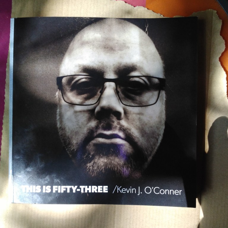
This Is Fifty-three, day 53
The proofs for the Just the Words, Man edition arrived today. I will be looking them over during the next couple days.
(17 August 2016)
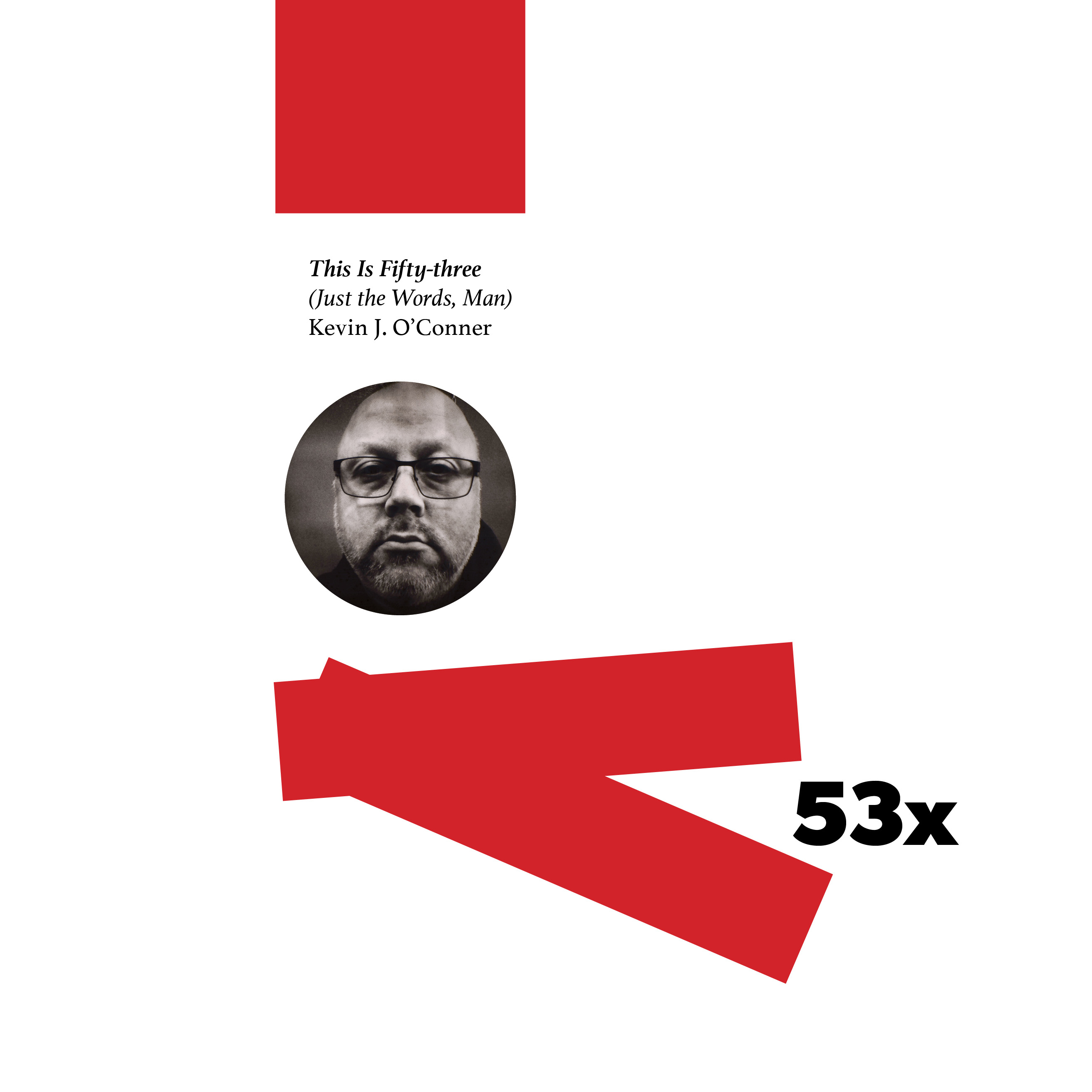
Front covers for the two print editions of This Is Fifty-three:

The first one, with the huge, full-bleed photo, is for the full-color edition. The strip of grey/silver at the left is done on purpose. Since my artwork does not wrap around, there is no way to ensure that the edges of cover and spine line up properly every time. Therefore, I had the spine background spill over slightly to front and back covers, as if it were tape. The red strip along the right edge is there because I felt like putting it there. I may still get rid of it; for now, I will keep it there, at least through the first printed proof.
The more minimal, faux-constructivist one is for the stripped-down ‘Just the Words, Man’ edition, which will omit all of the images and graphic embellishments except for those marking the beginning and end of each section. I thought this would be a good way to differentiate between the two editions, as opposed to adding a subtitle or additional text to the same cover.
Also, I get to use two different covers. That’s always fun.
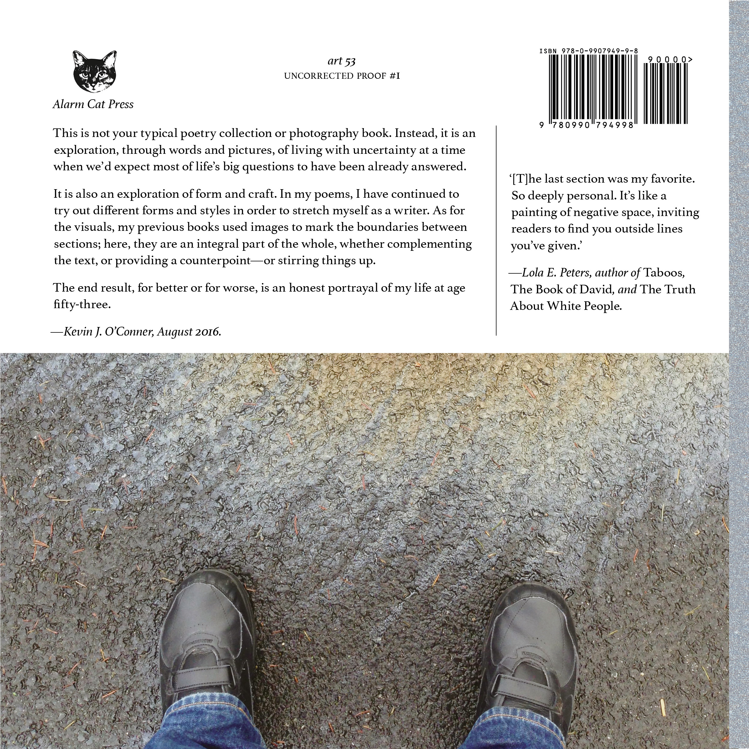
Here are the back covers:
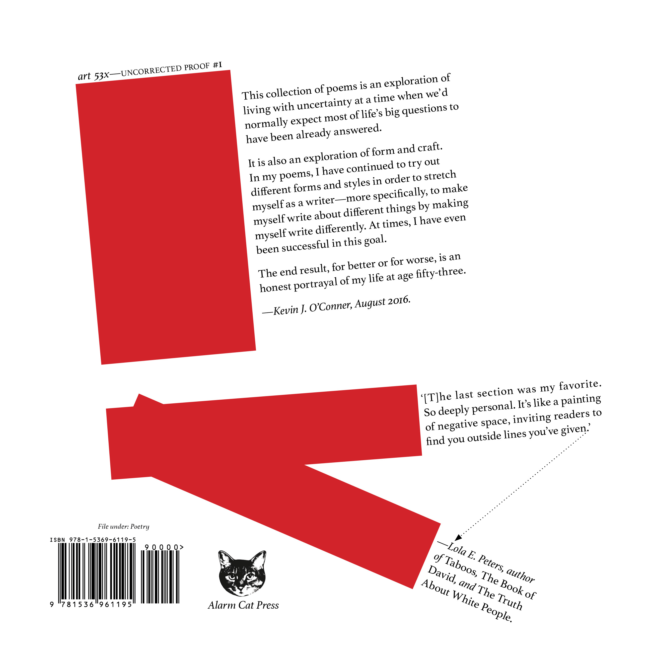
(7 August 2016)
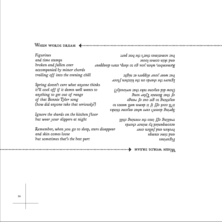
Managed to pull this one out at almost the last minute…
Continue reading
Today I worked on preliminary layout stuff for the first section of my new book of poems. Here’s a screenshot of the first page:

It’s time for bed, so a proper update will have to wait for tomorrow.
(10 May 2016)
