I have started work on my next collection of poems, This Is Not the Book That Will Save Your Life. Continue reading

I have started work on my next collection of poems, This Is Not the Book That Will Save Your Life. Continue reading
A lot of writers who self-publish take the do-it-yourself (DIY) approach. Often, this is not so much a choice as it is a necessity: putting together a book can be very expensive—potentially thousands of dollars. Doing as much yourself as possible can go a long way toward keeping costs down.
This Is Fifty-three, day 52
After a delay while CreateSpace technical support reviewed my file for the color version of This Is Fifty-three, I have finally been able to order a printed proof of the book. The anticipated delivery date is Wednesday of next week.
(16 August 2016)
This Is Fifty-three, day 51
I have ordered printed proofs of the Just the Words, Man edition of the book. I was going to wait for some $ to come in, but this is the inexpensive version, so I decided not to. The expected delivery date is August 22.
(12 August 2016)
This Is Fifty-Three, day 5x
Yesterday, I had to change a URL that unexpectedly changed. Until I can order printed proofs (still waiting on some $), that is about the extent of any adjustments I will be making at this point. So, technically, yesterday was day 50, and today (once the revised digital proofs are ready) will be 51—but I am just going to call it day 5x for now; when I order the printed proofs, or if I get the sudden, malicious urge to make some dramatic change, I will post an update with a real number. Until then, assume no significant developments.
(12 August 2016)
UPDATE: Oh, CreateSpace! You do amuse me so…
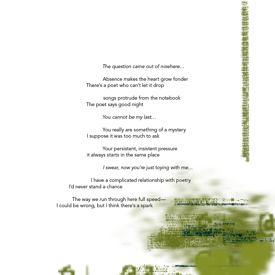
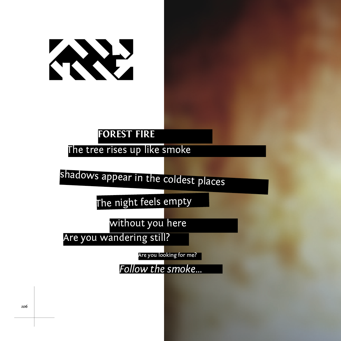
Following the latest review, CreateSpace notified me that three pages of my book have ‘illegible text’. Here are screenshots of the pages in question:
Page 103. I can only assume they were looking at the background image, which was made in part from text (I think it was either code, or an image file read with a text editor) as part of my 365 project about six years ago. As you can see, the text of the poem does not overlap any of the denser parts of the image, so it is actually very legible.
Page 106. I can make out the text. It’s pretty large for type (except for that one line, which is more the typical size for body text), so I am not sure how this is a problem.
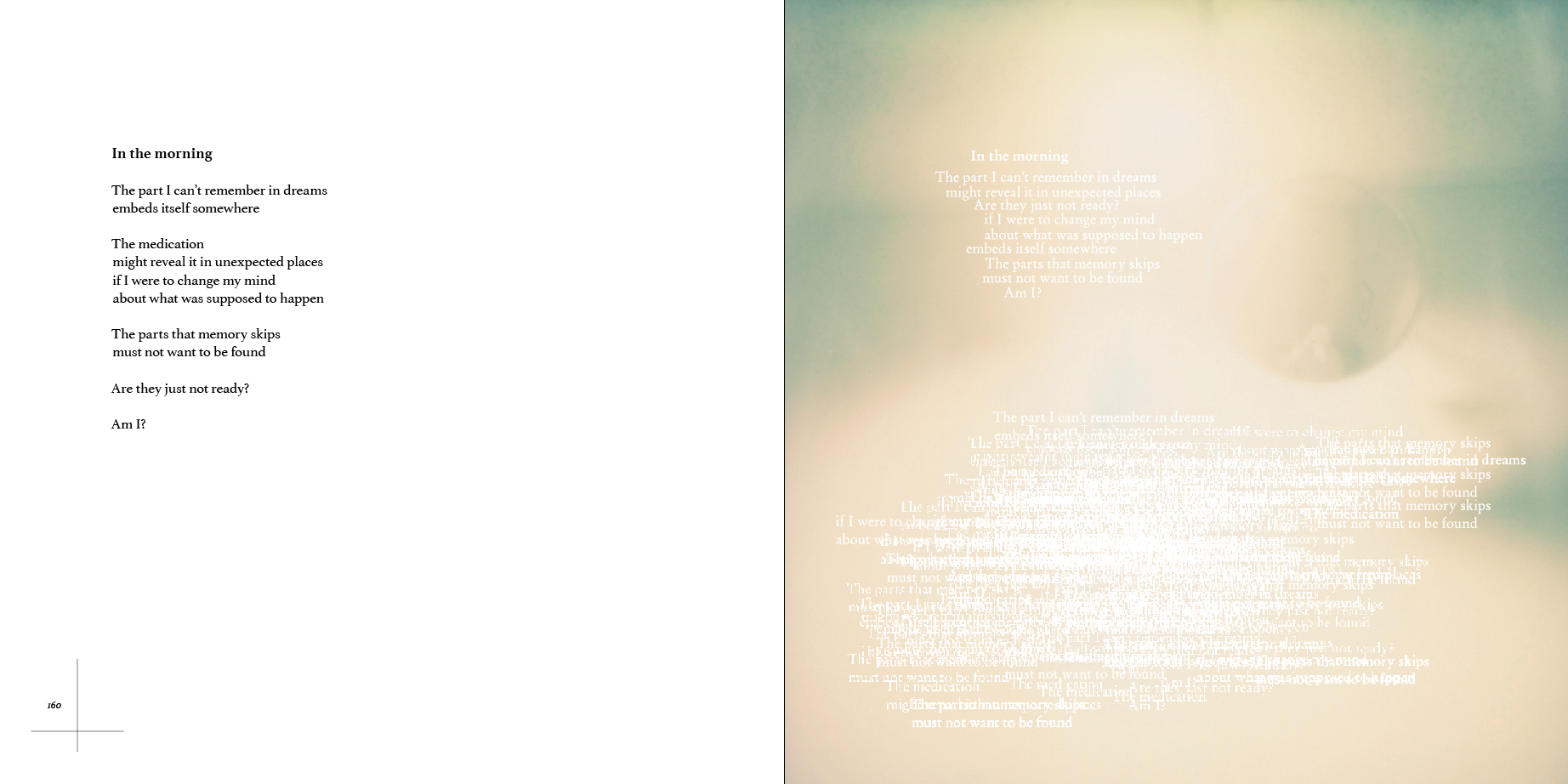
Page 161. Okay, here they almost have a point. I say ‘almost’ because the text on page 161 (to the right) is treated as a graphic, not as type. The type that appears in the upper half of the page is partly legible; in the lower half of the page, it is an overlapping mess o’ type. However, the actual text, the poem that people are supposed to read, is on page 160.
And none of these came up as problems during previous reviews. So relax, dear CreateSpace. Sometimes you have to let art just…flow…over you… (Gratuitous Big Chill reference for the win!)
(12 August 2016)
UPDATE UPDATE: Oh! And they just notified me that the other edition has passed review and is ready for ordering proofs. The poem on page 106 (the middle screenshot shown above) is rendered EXACTLY the same, only without the background photo…
(12 August 2016)
This Is Fifty-Three, day 49
I suspect this is getting dull, but it seems there is always one more thing to change…

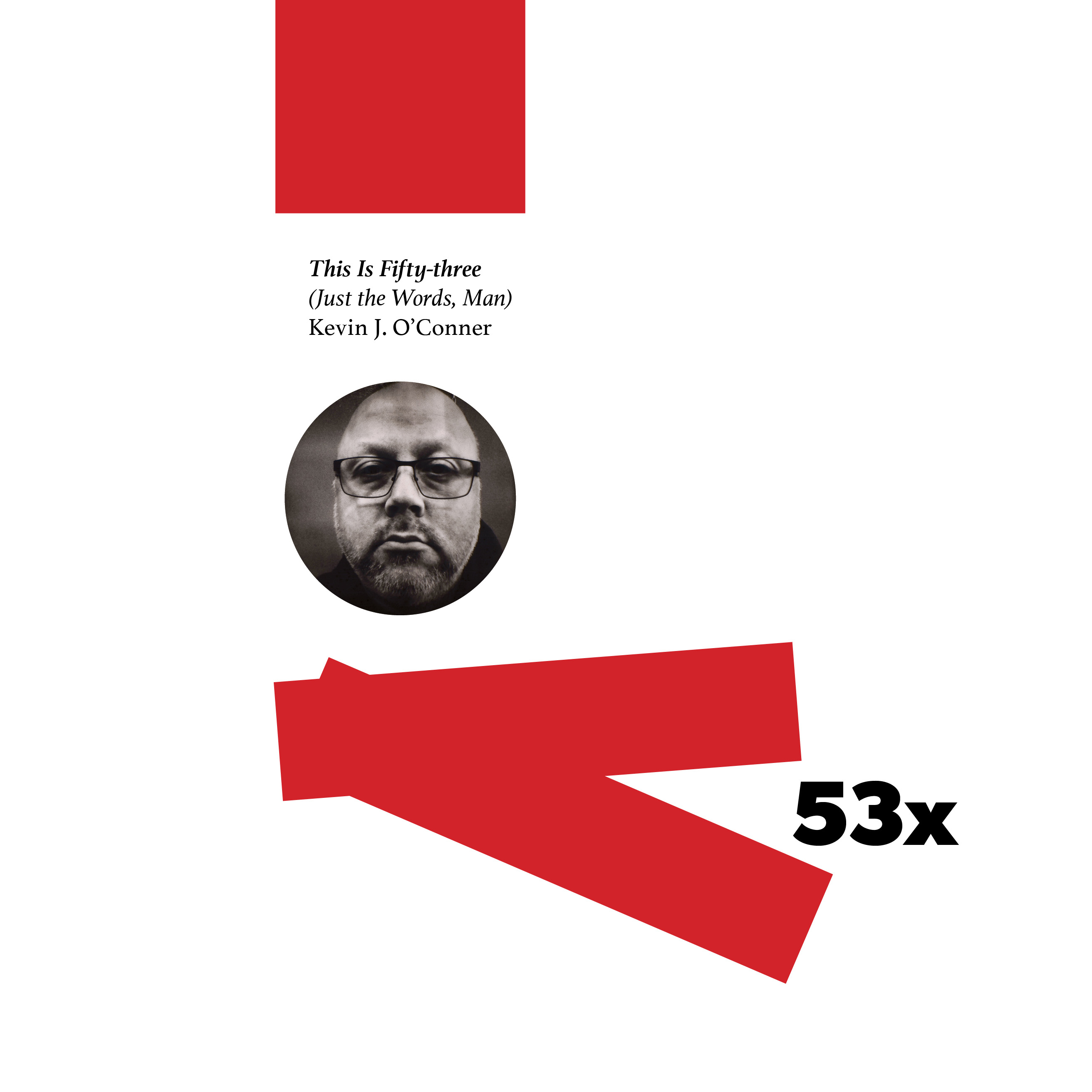
Front covers for the two print editions of This Is Fifty-three:

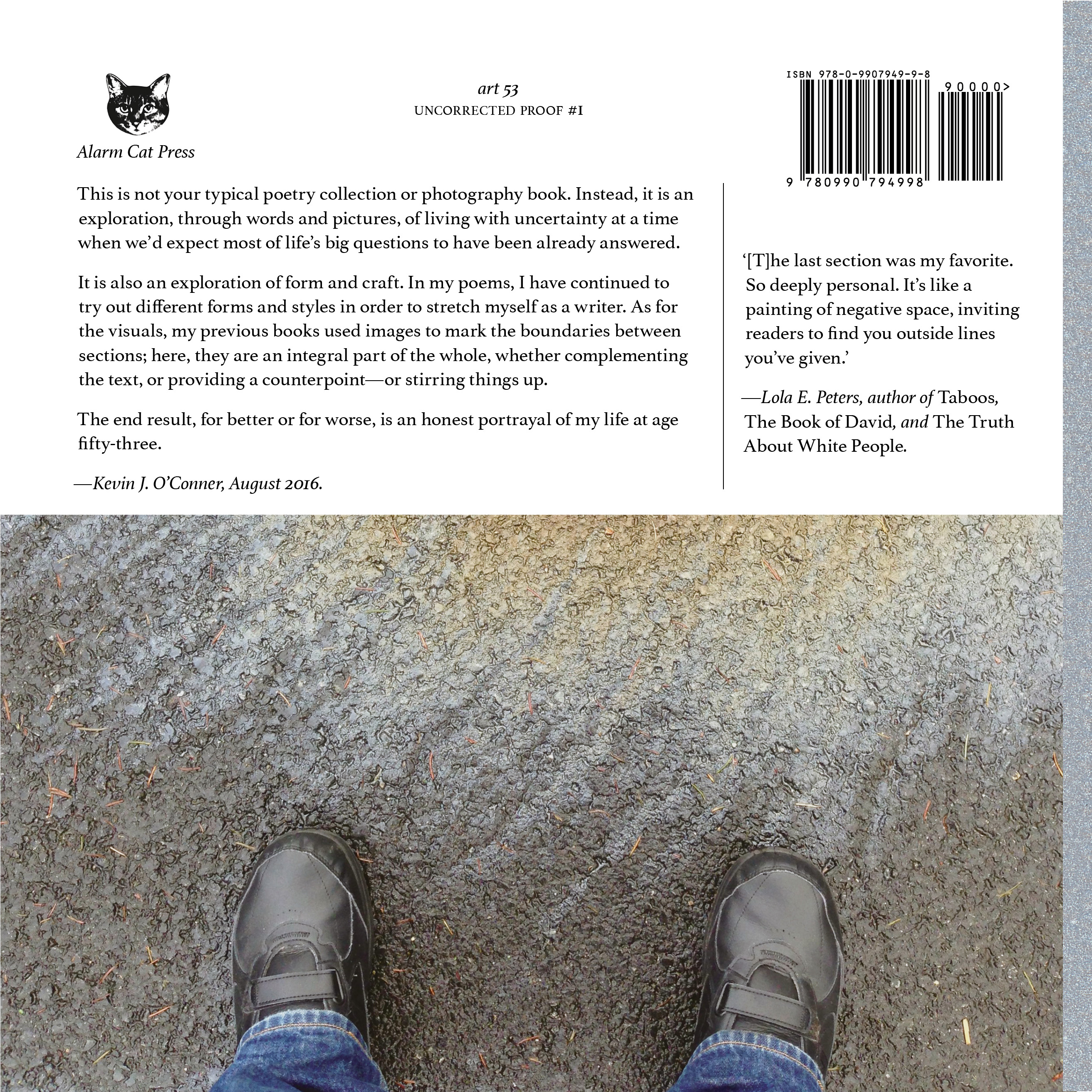
The first one, with the huge, full-bleed photo, is for the full-color edition. The strip of grey/silver at the left is done on purpose. Since my artwork does not wrap around, there is no way to ensure that the edges of cover and spine line up properly every time. Therefore, I had the spine background spill over slightly to front and back covers, as if it were tape. The red strip along the right edge is there because I felt like putting it there. I may still get rid of it; for now, I will keep it there, at least through the first printed proof.
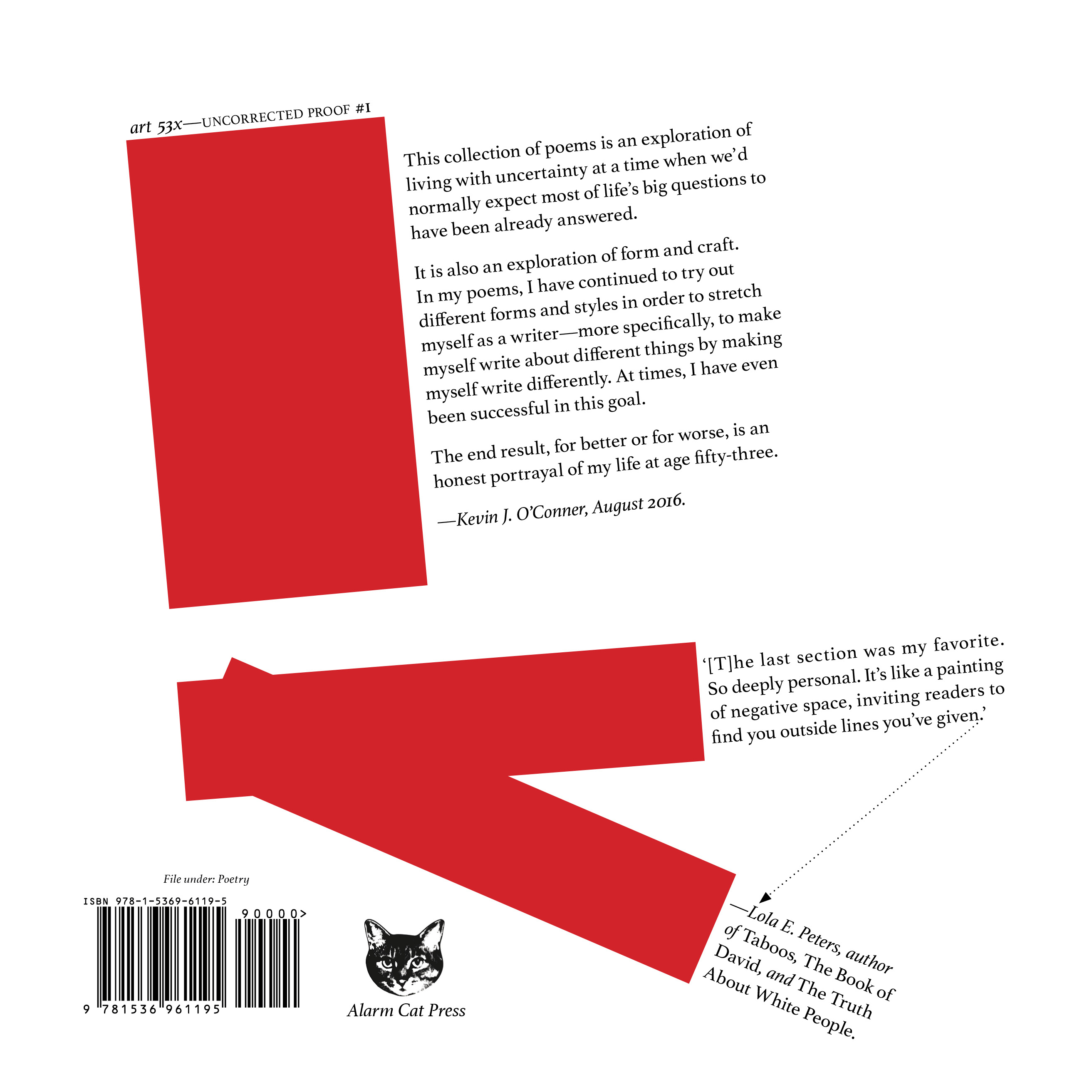
The more minimal, faux-constructivist one is for the stripped-down ‘Just the Words, Man’ edition, which will omit all of the images and graphic embellishments except for those marking the beginning and end of each section. I thought this would be a good way to differentiate between the two editions, as opposed to adding a subtitle or additional text to the same cover.
Also, I get to use two different covers. That’s always fun.
Here are the back covers:
(7 August 2016)
