I found this monstrosity this morning when I went to check my website for something:
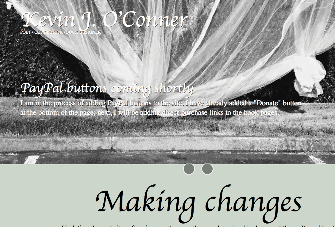
Yes, somehow the decent sans-serif typeface (Raleway) I have been using for my headings is appearing as this bit of ugliness. I checked the Customize options, and the typeface selection is correct—but, for some reason, is not being displayed. I will be looking into this after another cup of coffee or two…
Update, 8:54 a.m.
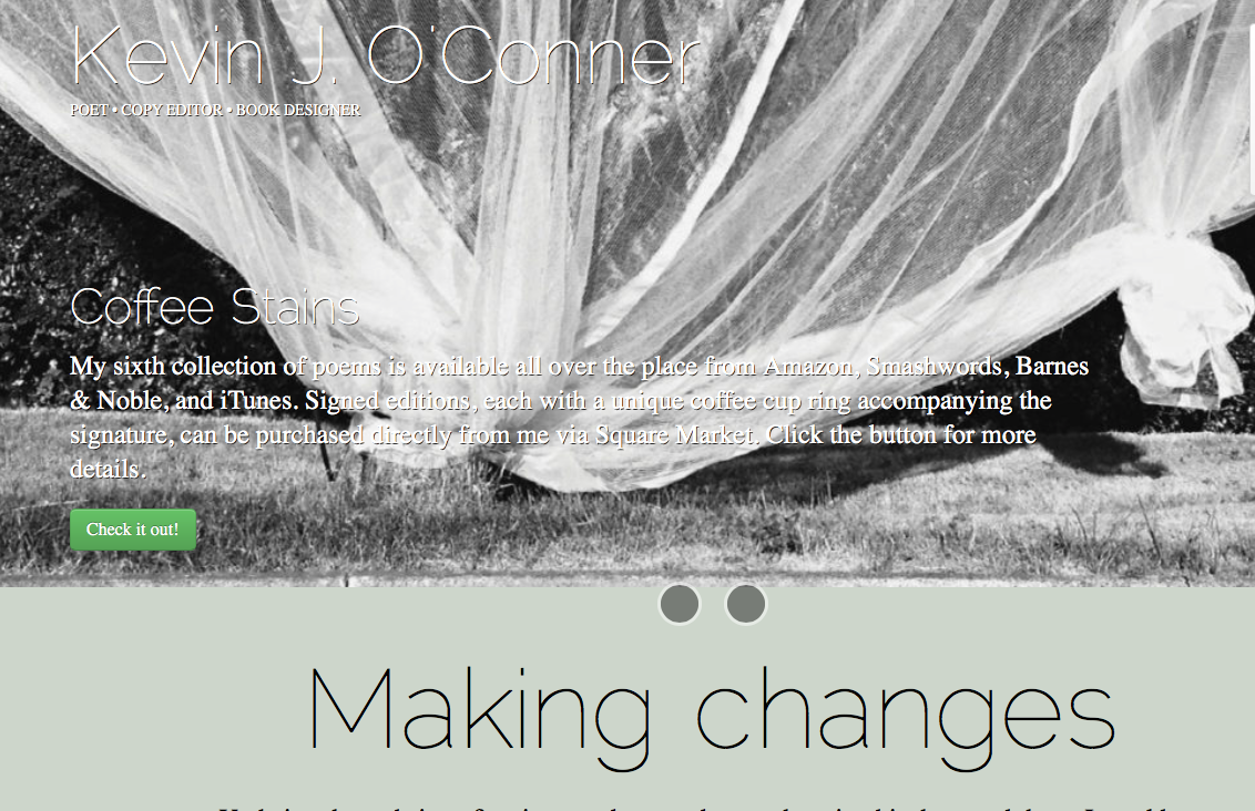
Okay, I am officially confused. Here is what it looks like on my desktop computer—this is what it is supposed to look like:
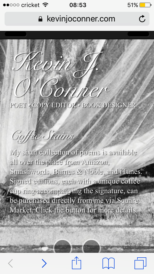
Here is what it looks like when I click on View full site in Safari on my phone:
If you can, please take a look—https://www.kevinjoconner.com. If it doesn’t look like the middle screenshot above, please let me know. Thanks!
Update, 9:58 a.m.
Changed the typeface for headings to PT Sans. A different typeface still shows when I view the site on my phone, but at least it is still a sans-serif. For now, anyway, the site is displaying consistently on my desktop and my laptop. PT Sans also has the advantage of being one of the typefaces I used for my first book, Separation Anxiety, so it provides a bit of continuity.
Onward…
(30 June 2016)

