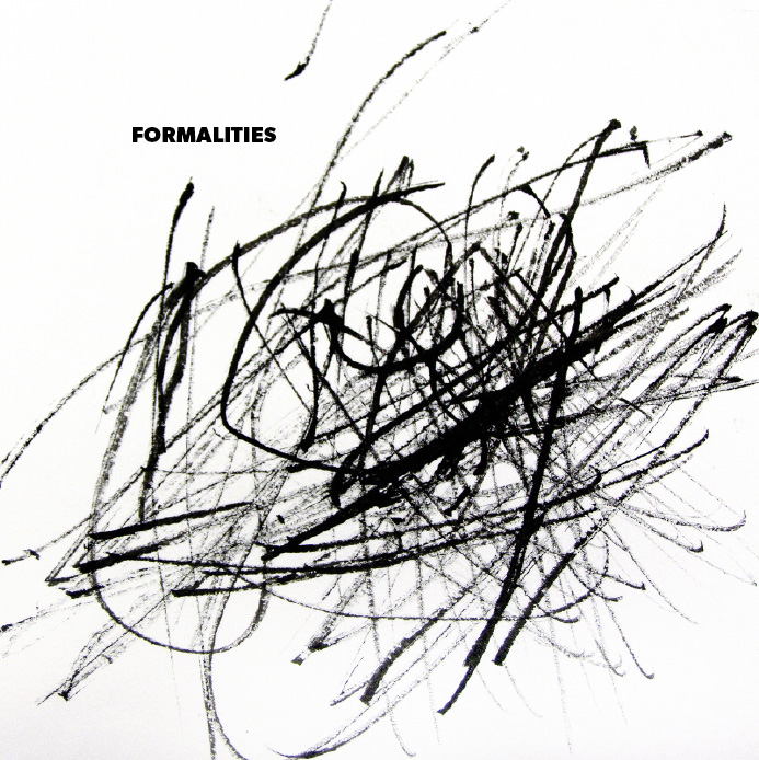
This Is Fifty-Three, days 15 & 16
Briefly interrupted by actual paying work (and one missed opportunity), I have been back at it the last couple of days, first updating my files with new poems, then creating initial layouts for the Formalities section.
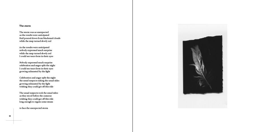
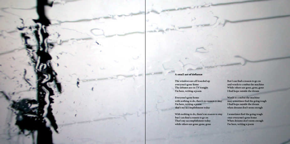
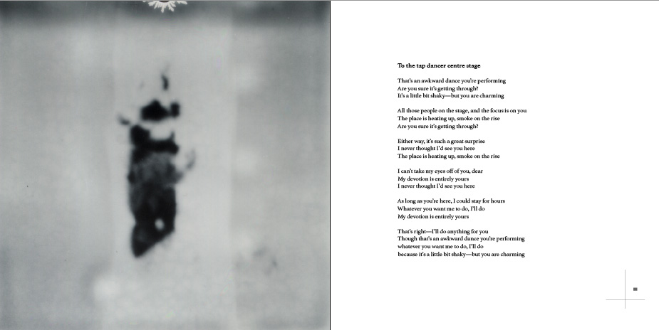
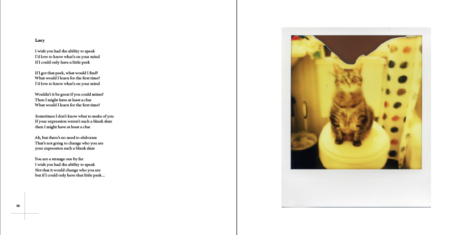
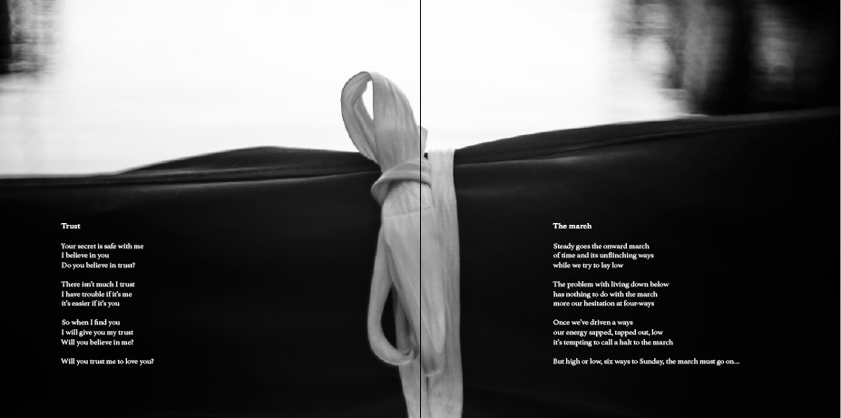
As I suspected, I did not once look at any of my notes while working on the layout stuff. Instead, I relied upon intuition in choosing the images to accompany the poems in this first part. I figured that I will make changes later on, so I tried not to be overly concerned with switching anything out once it was placed.
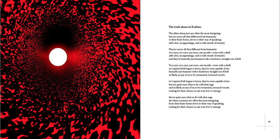
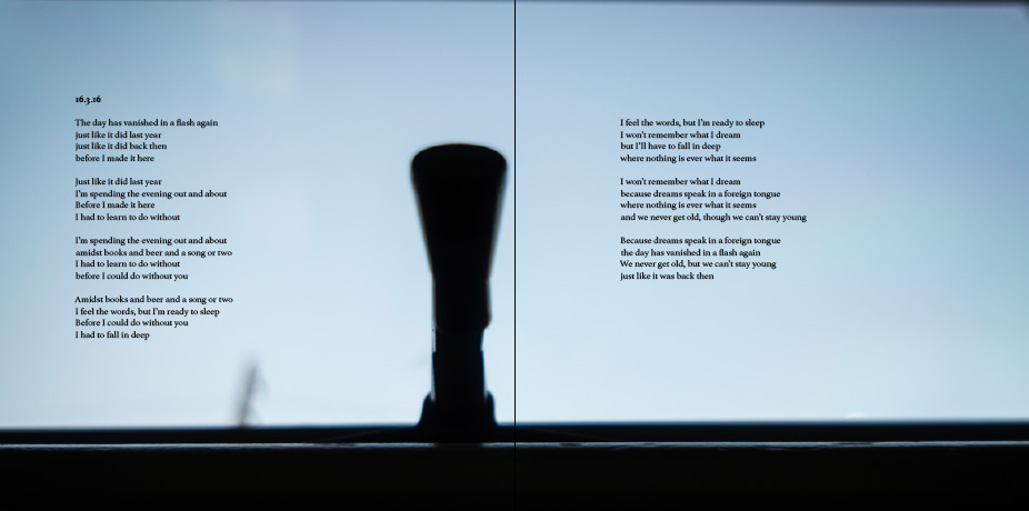
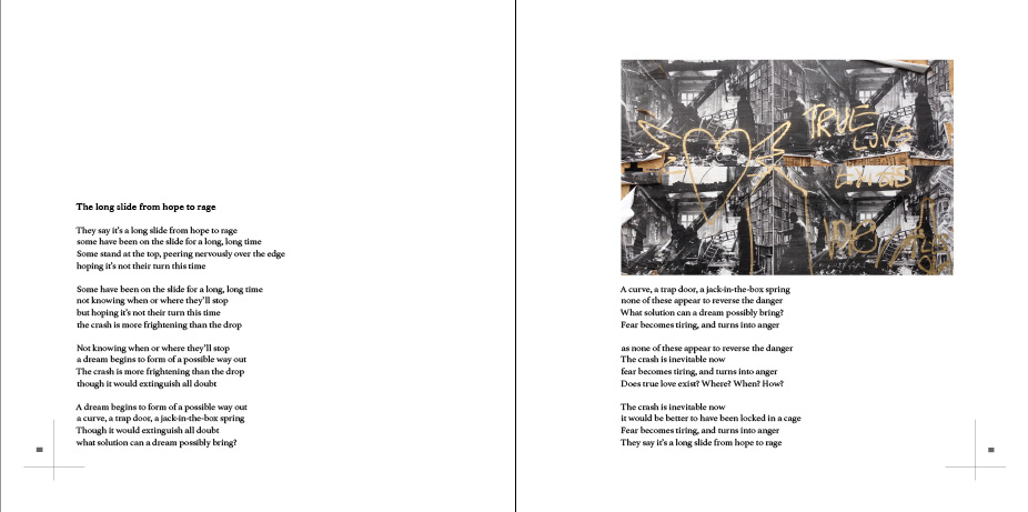
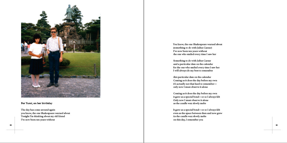
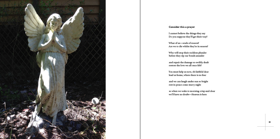
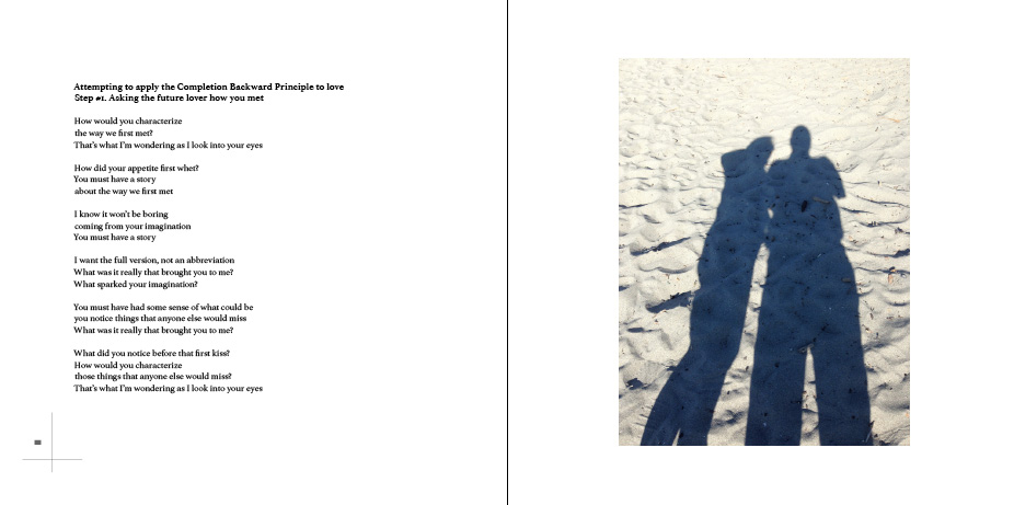
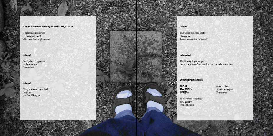
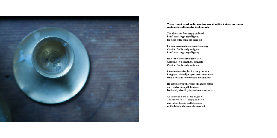
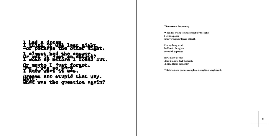
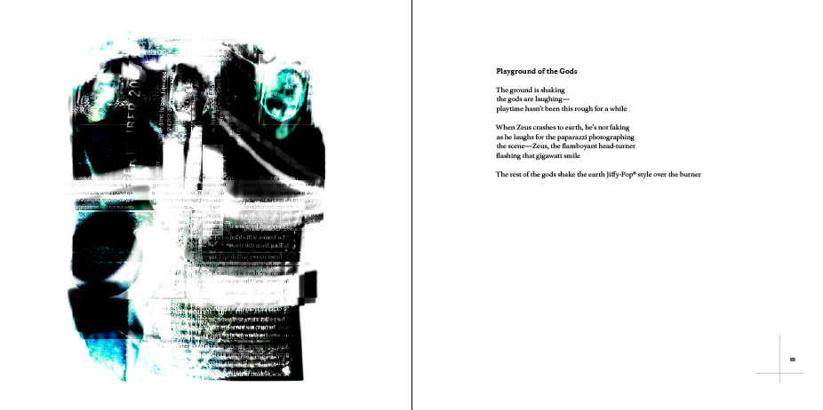
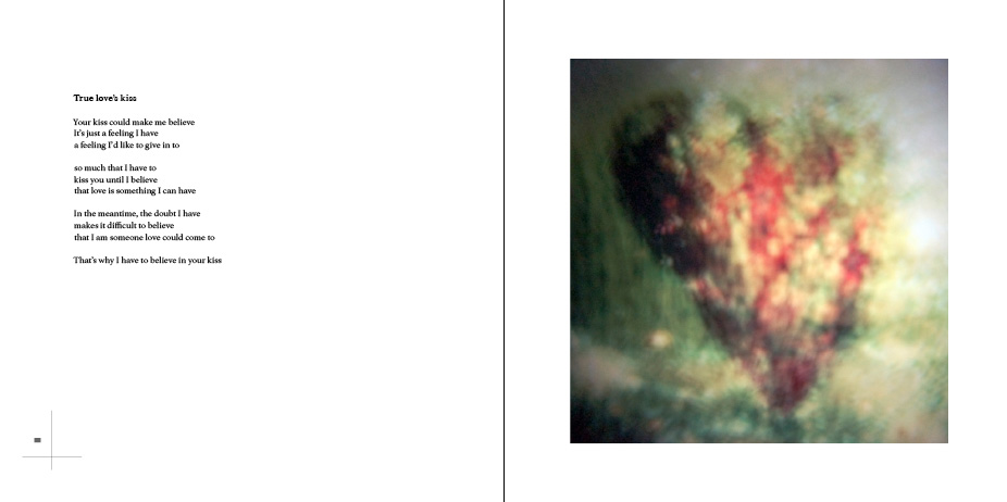
Otherwise, since the section is called Formalities (because I used specific poetic forms—namely terzanelle, tritina, viator, haiku, pantoum, lune, and landay), I kept things relatively simple. That is, text and image, with no embellishments or processing, letting everything speak for itself.
Here are screenshots of yesterday’s work:


The finer details, so far:
- Section divider typeface: Gibson bold, 18 pt., all caps
- Poem titles: Athelas Bold 12/14
- Poem text: Athelas Bold 11/14
- Margins, text pages: 1″ top and bottom, 1.75″ inside, 1.25″ outside
- Margins, photo pages: 1.125″ inside, otherwise 1″ all around
- No. of columns: Six
- Baseline grid: 14 pt.
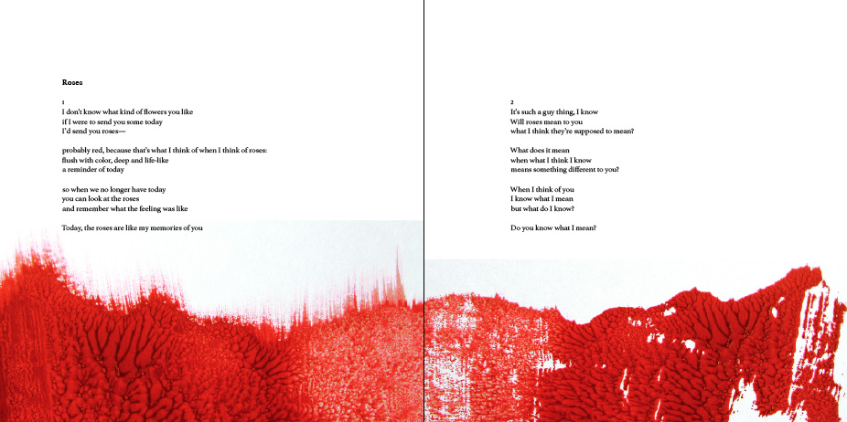
- Every fifth spread has a full image bleed across the spread.
- On pages where images share space with text, the text aligns at the bottom of the live area.
- On pages with text inside a full-bleed image, placement within the grid may be dictated by the contents of the image.
Next I tackle the Oddities section…
(11 May 2016)

